Recruiting the next generation of neuroscientists
Zuckerman Institute for Mind Brain Behavior at Columbia
Website & Design System
Read the Case Study
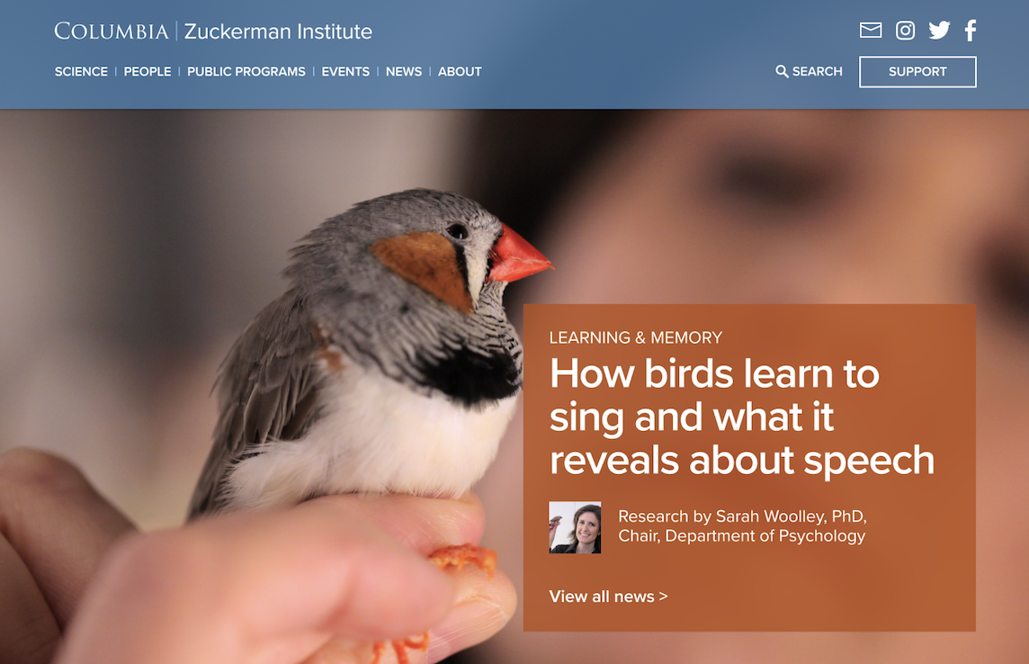
Mule Design set about creating an online resource that would amplify the Institute’s physical center. We helped the Institute identify product opportunity areas, differentiate among peer institutions, and craft thoughtful UX that would foster the joy of discovery and speak to the next generation of neuroscientists.
At the outset, the goal for the project was to showcase the work of the Institute in service to building enthusiasm around science. The work supported the development team’s efforts to attract the funding necessary to continue this vital work long into the future. The site had to be credible to peers, welcoming to everyone, and interesting to people who love science.
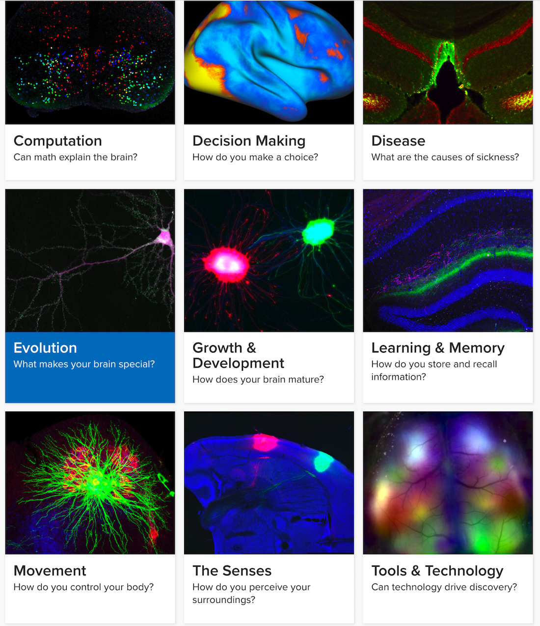
To provide paths for both the scientific audience and science enthusiasts, we structured the work by theme and created starting points around different areas of scientific inquiry. This organizing principle provides enough structure to make the information easy to dive into while also being sufficiently flexible to accommodate the scale and growth for the years to come.
Path-Based Interaction Design for Web
The website will be the first place people look after picking up a postcard or reading an article in the New York Times. It must make sense not only to the scientific crowd, but also to journalists, donors, and to the community living in West Harlem and the South Bronx curious about the Institute’s public programs. It’s tough to make basic research exciting while it’s in progress. It’s the type of work that requires decades of investment to bear fruit but serves as the foundation of tangible benefits to society. Our question was how to make the work of the Zuckerman Institute accessible.
Most online neuroscience resources are written for expert audiences. Even if the material is clear, it exists on sites the general public does not know about and would have no reason to visit. Siloing science off from the masses will only create bigger problems down the road for science and society. This is not a new challenge for the scientific community — it’s ongoing. Research for research’s sake is important work and is lately under constant threat.
Our research revealed that avid science readers seek out primary sources to make sense of science articles in the news. They turned to Wikipedia and other reference sites to understand the context and import of new discoveries. Their science news browsing habits differ from the rest of their media diet. In general, they might read science news less often but they go much deeper. Neuroscientists and high school science teachers alike love science Twitter.
KEY OUTCOMES
Site relaunch in conjunction with Columbia University Mortimer B. Zuckerman Mind Brain Behavior Institute’s official opening.
Site traffic increased by over 70%
Site relaunch in conjunction with Columbia University Mortimer B. Zuckerman Mind Brain Behavior Institute’s official opening.
Site traffic increased by over 70%
Visit the Site


Site Launched July 2017
Connecting research outcomes to design
The site’s information architecture supported entrypoints we identified during design discovery. We collaborated with the Zuckerman Institute’s communication team to ensure that the style of these cards held true to the organizing principles of the Institute itself.

Exploring the space where technology, design, and business overlap.
© Larisa Berger 2019 All Rights Reserved