Creating access to a global movement for the Wikimedia Foundation
Wikimedia Foundation
Website & Design System
WikimediaFoundation.org
Founded in 2003, the Wikimedia Foundation was started to fund Wikipedia and keep its servers running. Since then, the Foundation has grown to encompass the needs of Wikimedia’s many diverse communities and projects to support the work of over 200,000 volunteers worldwide. In 2017, the Wikimedia Foundation approached Mule Design to create — not a wiki — but a website that could convey the unique work of the Foundation to a broader, external audience.
Mule Design aimed to give Wikimedia a useful front door that would serve them for years to come and create a concrete way to communicate with Foundation staff. We distilled the work of over 300 staff and 200,000 volunteers into three areas of focus: Research, Advocacy, and Technology.
We also worked with Wikimedia to expand their notion of what the site could be, from primarily a fundraising funnel to a knowledge hub for research, advocacy, and technology. The result? Fundraising actually increased 1,000% .
IT ALL BEGINS WITH RESEARCH
Mule helped Wikimedia answer such crucial questions as,
“How should Wikimedia talk about their multifaceted work?
What entrypoints can we provide for the public?
How can we clarify the Wikimedia Foundation’s purpose in an inclusive way?
How can Wikimedia stay true to its global community by creating a truly multilingual site?”
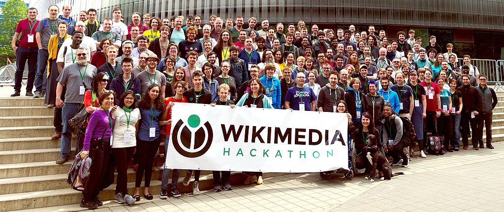
In order to converge on this lasting model and information architecture we immersed ourselves in the special world of Wikimedia. We attended their annual 3-day conference, Wikimania, with over 2,000 in attendance—volunteers, staff, and affiliates from across the globe. We also conducted ethnographic research and interviewed over 50 members of the Foundation staff and community spanning four continents. All this information was counterbalanced with data from major donors and peer organizations.

We used information from our interviews to craft variants of call-to-action modules throughout the design system as starting points for the content strategy.
KEY OUTCOMES
Increased fundraising 10x. First Wikimedia design system to support true multilingual capabilities.

Site launched August 2018

Visual design update 2019
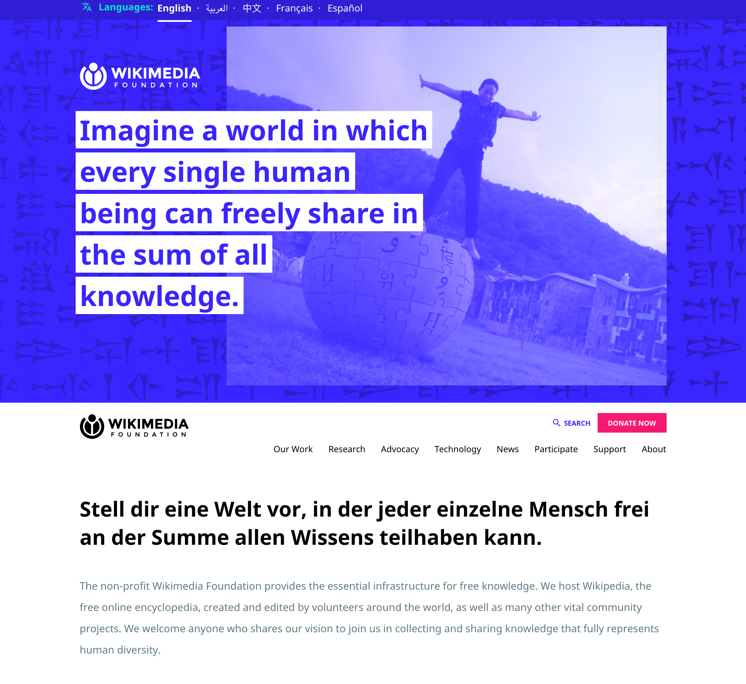
Many Wikimedians volunteer their time to improve their language skills. To surface the multilingual skills inherent to their community we designed the site to include not just the user’s selected language, but a rotating second language for certain elements (bold text on launch, yellow rectangle in 2019).

This project was a culmination of a series of projects with the Foundation including 2016’s brand project. where we simplified the Wikimedia brand mark to improve the consistency and flexibility of the Wikimedia brand system.
We also supplied the Foundation with a starter set of materials: business cards, letterhead, event badges, pins, and more all organized within a wiki to support Wikimedia’s internal workflows and process.
Exploring the space where technology, design, and business overlap.
© Larisa Berger 2019 All Rights Reserved